Components
Animated Tabs
A tab component with a moving active pill and directional content transitions.
interactivemotionanimationtabsaccessibility
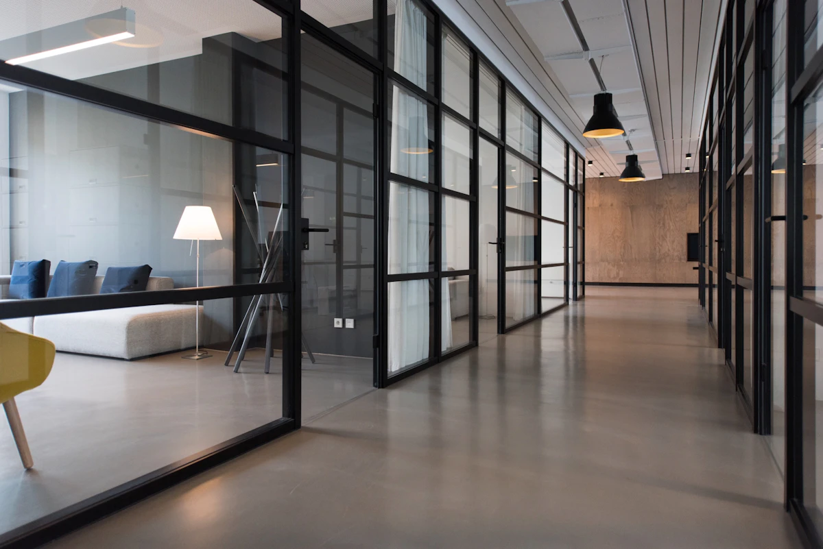
One workspace for everything
Bring docs, tasks, and discussions together so your team always has a single source of truth.
Installation
$npx shadcn@latest add /r/animated-tabs.jsonAPI Reference
| Prop | Type | Default | Description |
|---|---|---|---|
items | AnimatedTabItem[] | - | Tabs to render. Each item is { value, label, content }, where content is any React node. |
defaultValue | string | - | value of the tab selected on first render. Defaults to the first tab. |
className | string | - | Classes merged onto the outer wrapper. |
listClassName | string | - | Classes merged onto the tab list (the pill track). |
triggerClassName | string | - | Classes merged onto each tab trigger button. |
contentClassName | string | - | Classes merged onto the content panel wrapper. |
Customization
- Pass
classNameto restyle the component — classes are merged withcn, so your utilities win. - Styling uses Tailwind utility classes and theme tokens, so it adapts to light/dark mode automatically.
- Tune behavior with the props in the API reference above (e.g.
items).